Rising to the challenge of crafting a timeless brand for an evolving business
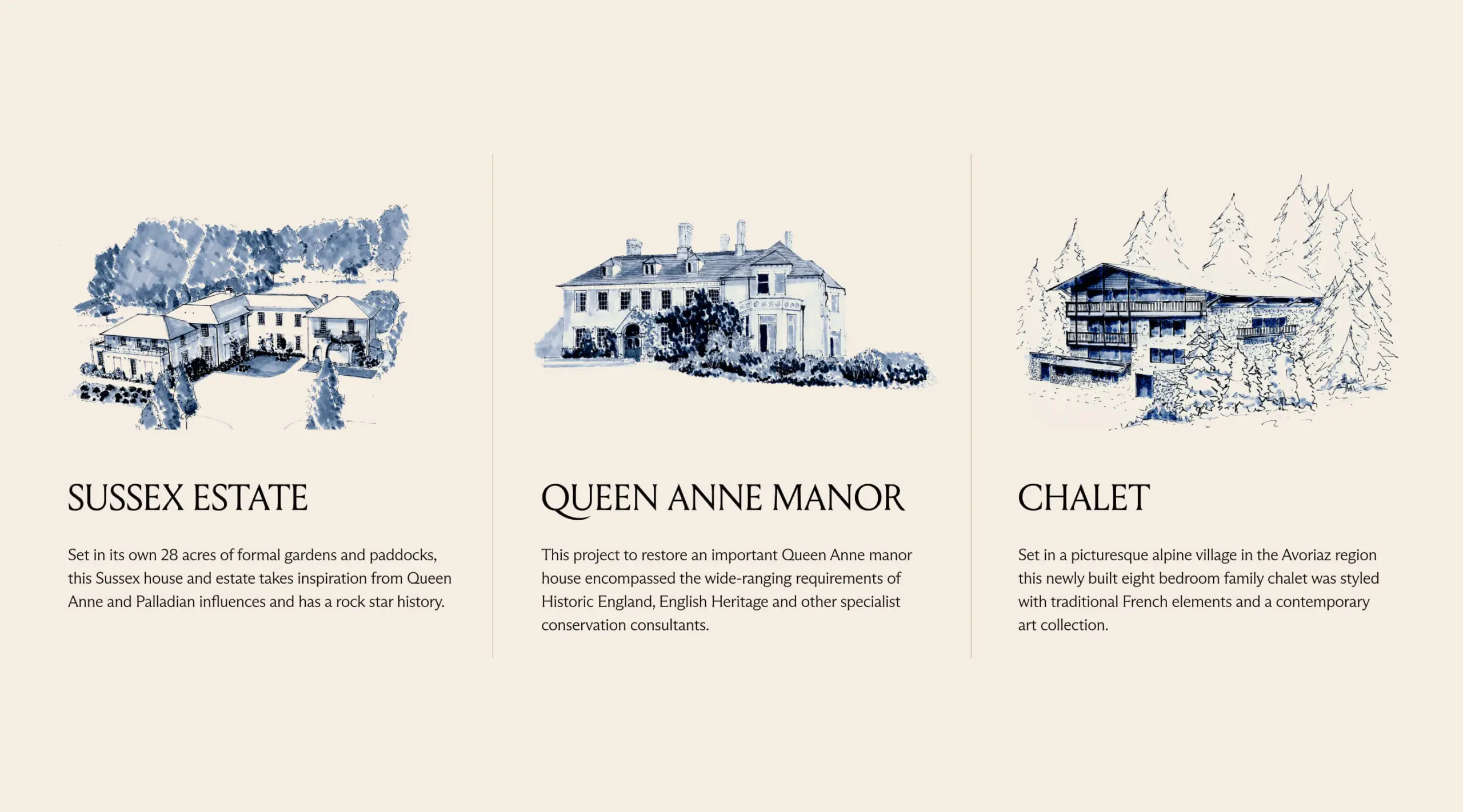
Since Ascend first created Studio Hooton’s brand in 2018, the studio had evolved significantly. Its portfolio had grown in scale, complexity and value, with an expanding mix of residential projects across London and the countryside.The existing identity no longer reflected the depth, warmth or character of the work, or the technical expertise behind it.
The challenge was to create a more sophisticated rebrand that could support Studio Hooton’s next stage of growth while remaining true to the personality of the practice.
As a brand strategy and design agency, we saw a clear opportunity to position Studio Hooton around three distinctive strengths: technical capability, originality and its ability to move confidently between city and country.
The new positioning needed to balance London sophistication with country and heritage expertise, without feeling overly traditional, decorative or provincial.
View the website at studiohooton.com
- Lifestyle & Culture
Brand Strategy, Identity Design, Animation, Copywriting, Guidelines, Website, Social templates
Solution:
Our brand strategy centred on the idea of Perennial—interiors with enduring character, designed to outlast trends while remaining deeply personal to the people who live in them.
The idea gave Studio Hooton a stronger and more distinctive point of view: timeless rather than traditional, refined without feeling formal, and grounded in the studio’s ability to combine creative instinct with exacting technical delivery.
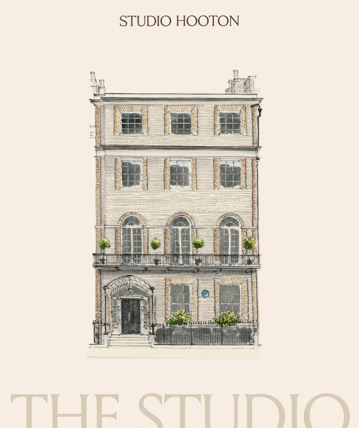
From this strategic foundation, we developed a refreshed brand identity that brought greater warmth, confidence and character to Studio Hooton, while better reflecting the calibre and complexity of the projects it now delivers.
The result is an interior design brand that feels equally at home in London and the countryside, bridging classic and contemporary influences without being defined by either.
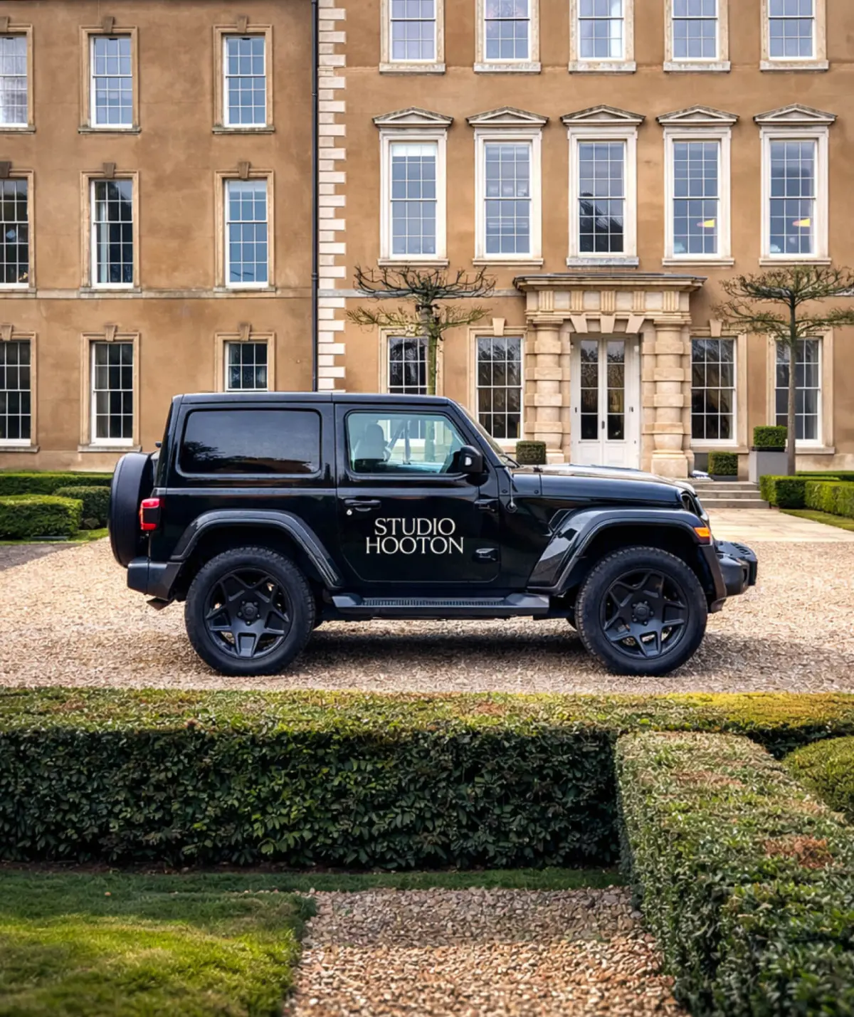
System:
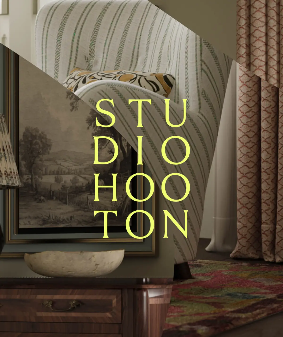
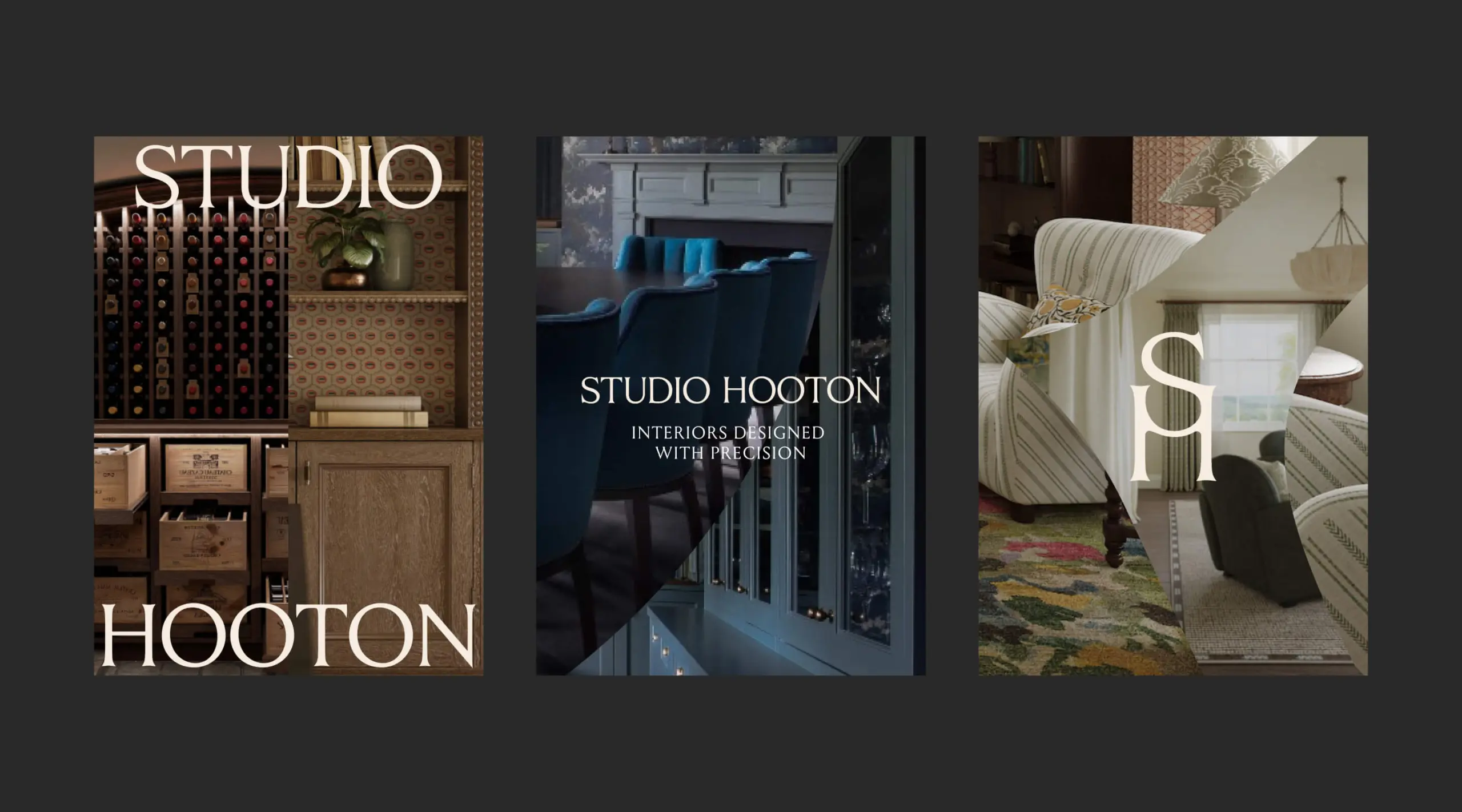
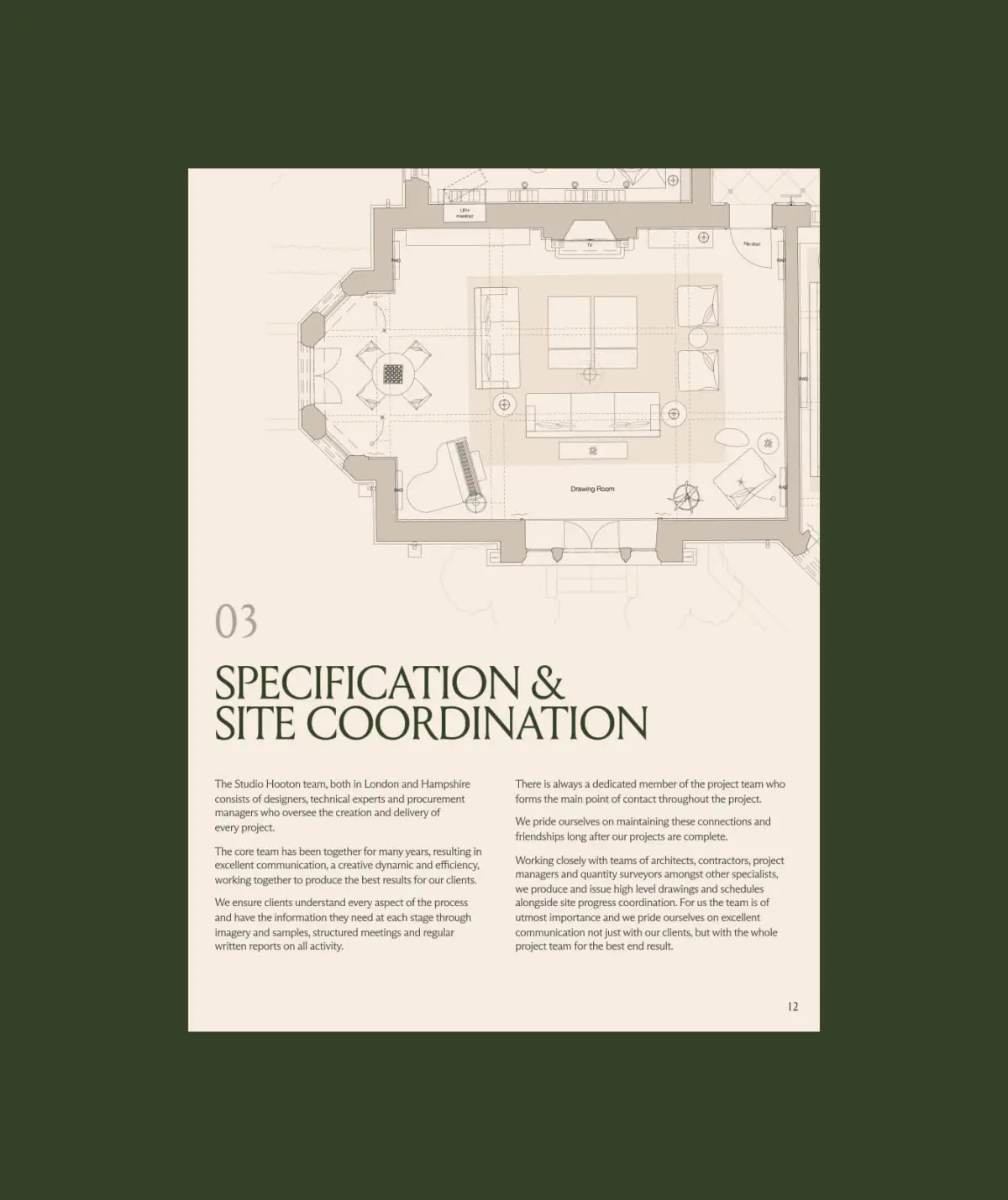
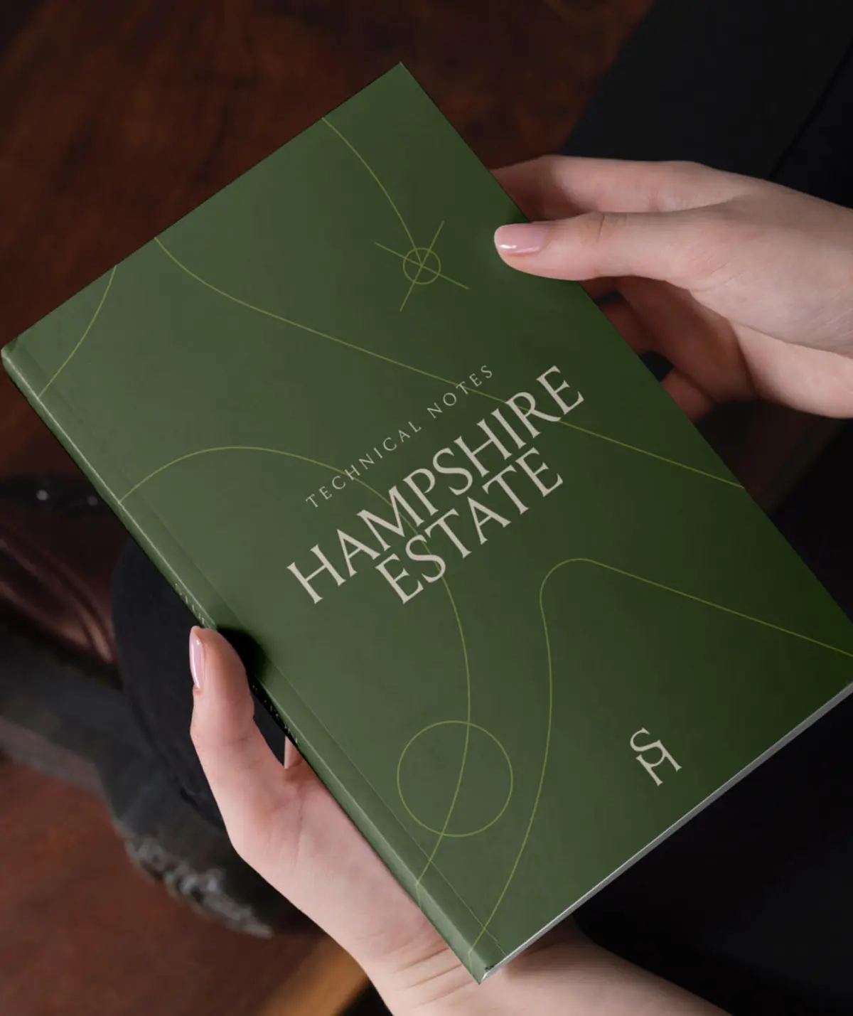
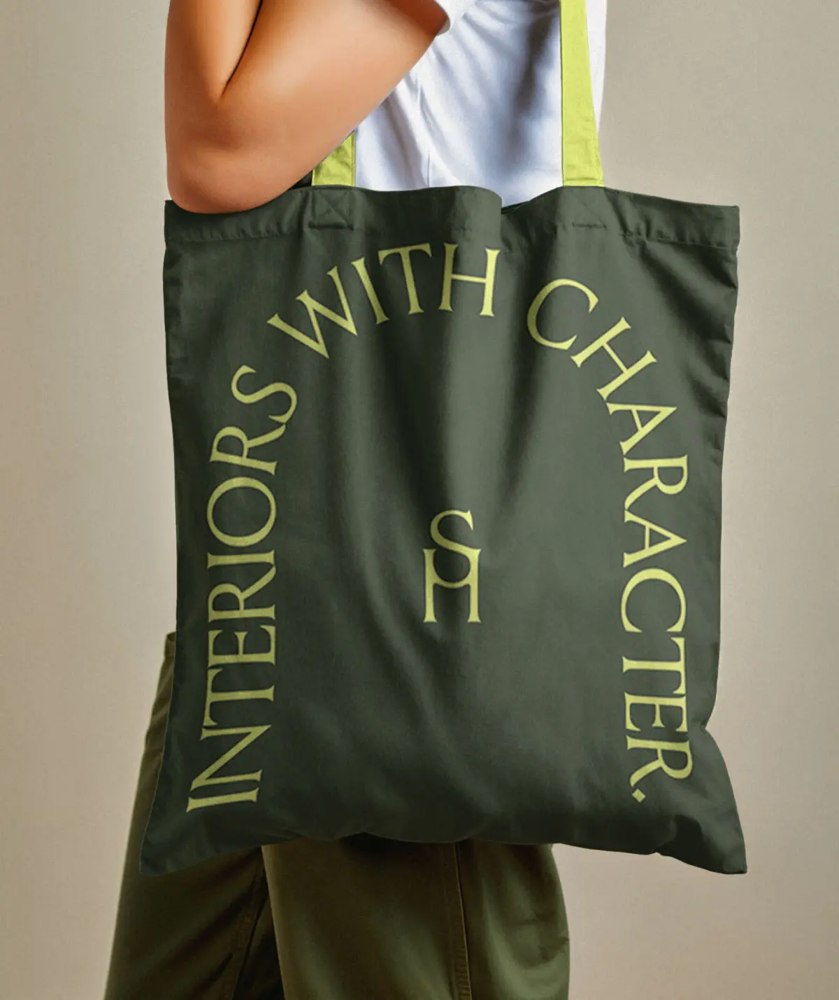
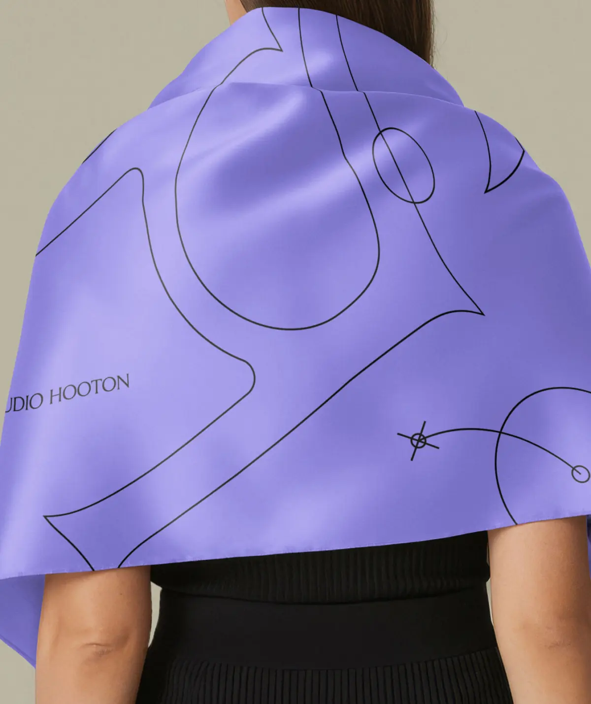
At the heart of the new visual identity is 'Living Frameworks', a dynamic typographic system inspired by Studio Hooton’s own approach to interior design.
Just as every interior responds to a different property, client and context, the system is designed to flex and adapt. The typography—Louize Display from 205TF—shifts within a series of distinctive frameworks, creating different compositions for different content, spaces and applications while retaining a recognisable underlying structure.
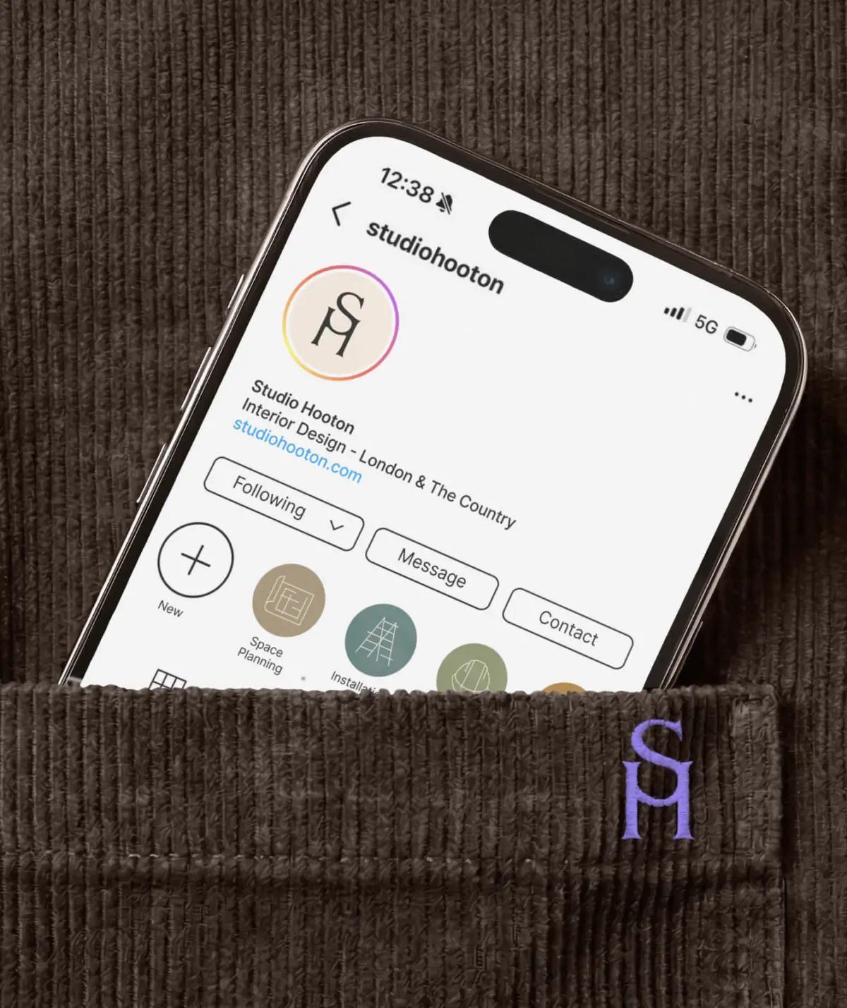
This dynamism gives Studio Hooton a more expressive and ownable brand design system, capable of adapting across digital and physical environments without losing consistency.
The result is a visual language that feels ordered but never rigid, bringing together precision and personality in a way that reflects the studio itself.
Website:
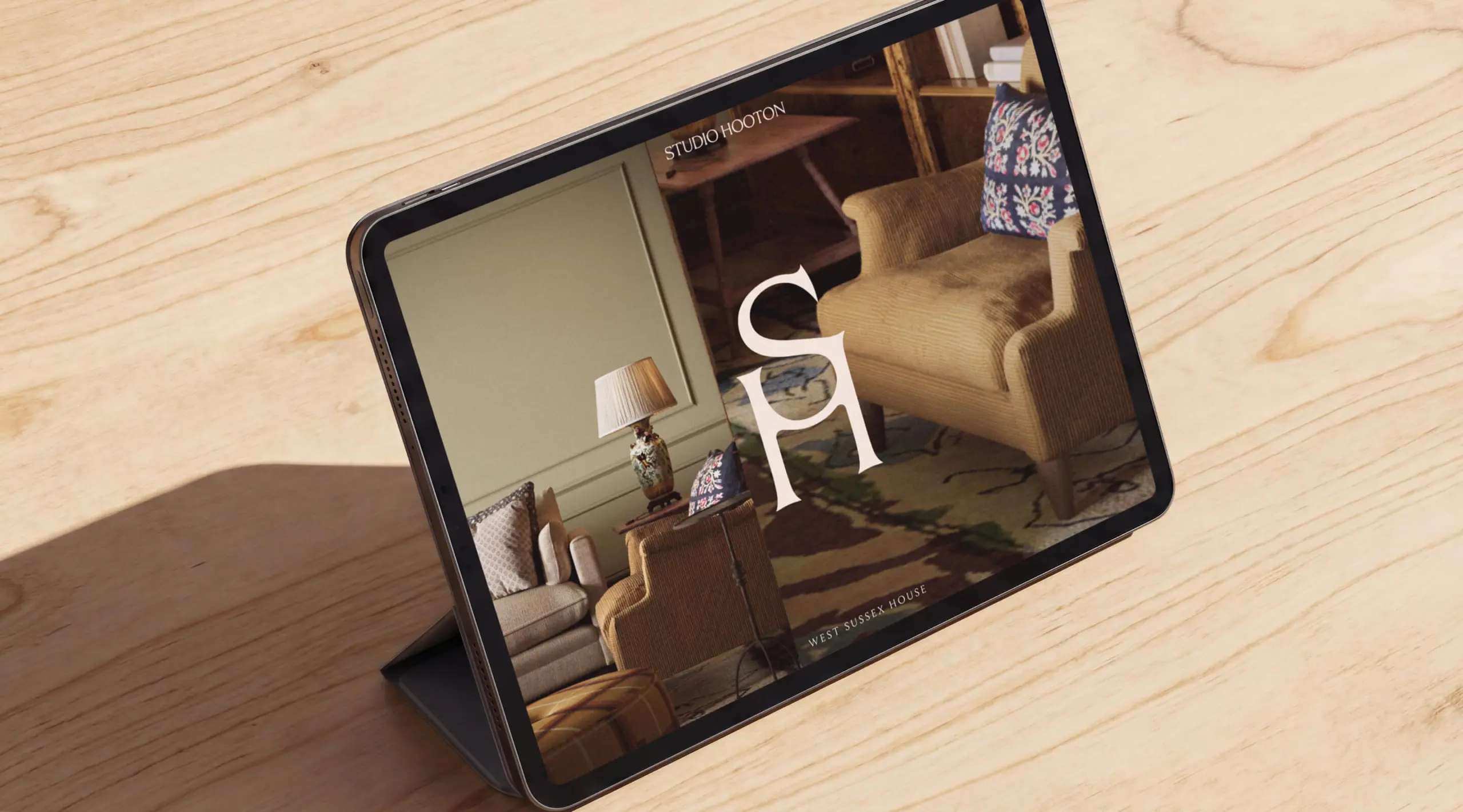
The new website translates the refreshed brand into a richer and more immersive digital experience, giving Studio Hooton’s interiors space to take centre stage while communicating the expertise behind the work.Our website design and UX approach uses flexible layouts derived from the Living Frameworks system to create rhythm and variation across project pages, editorial content and studio messaging.
Generous photography, considered typography and a clearer content hierarchy allow the site to communicate both sides of Studio Hooton: the individuality and warmth of its interiors, and the technical knowledge required to deliver complex, high-value residential projects.
The new brand and website now give Studio Hooton a more confident digital presence, better positioning the practice for its next stage of growth while preserving the personal character that has always defined the studio.