Since 2013, Crosstide (formerly ‘101 Ways’) has enabled enterprise organisations to drive value through data and technology. The company builds custom software and delivers data and AI transformation for the financial services, healthcare and retail sectors.
When they approached us, they had a strong track record but low brand recognition, a name that no longer reflected their focus, and a visual identity that didn’t match the ambition of their new leadership or strategic goals. With plans to pivot more firmly into the conservative financial services sector, a more refined and sophisticated tone was needed. Internally, the team needed something to rally behind. Externally, they needed a brand that would build trust with senior enterprise buyers.
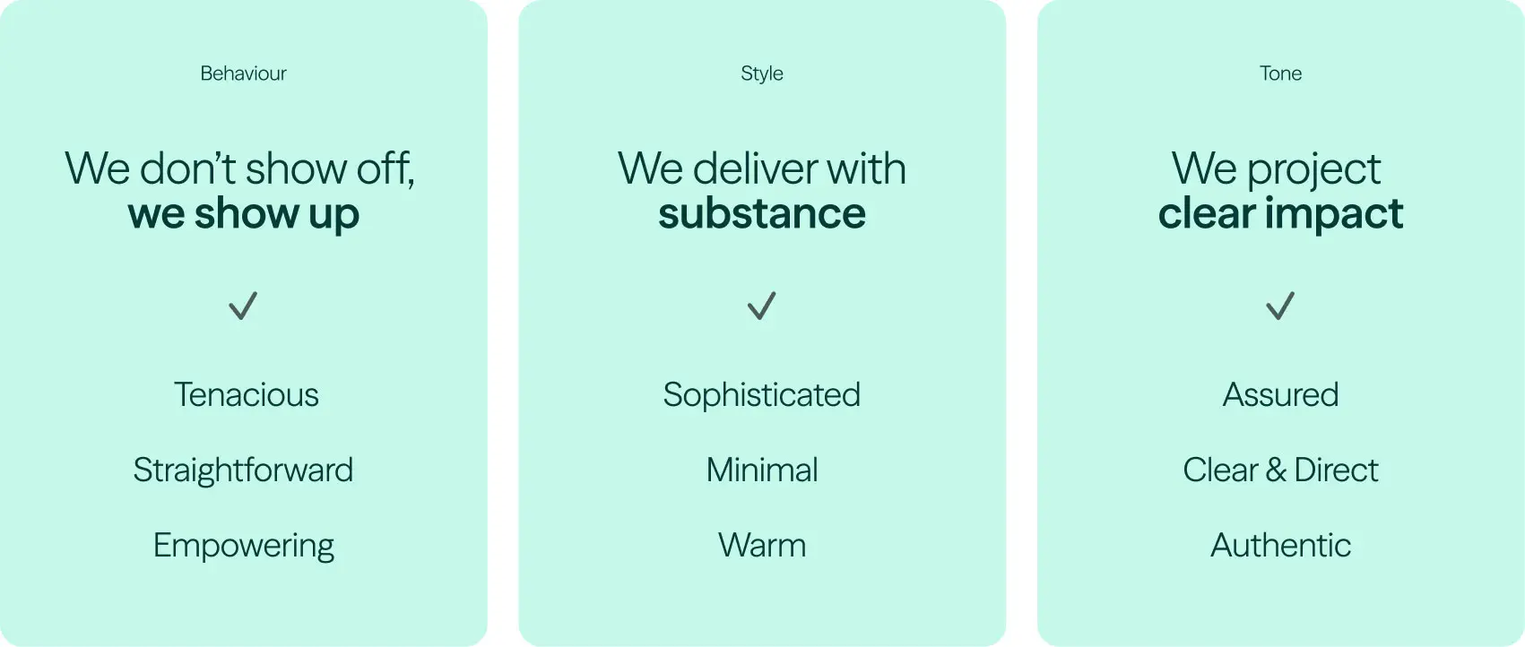
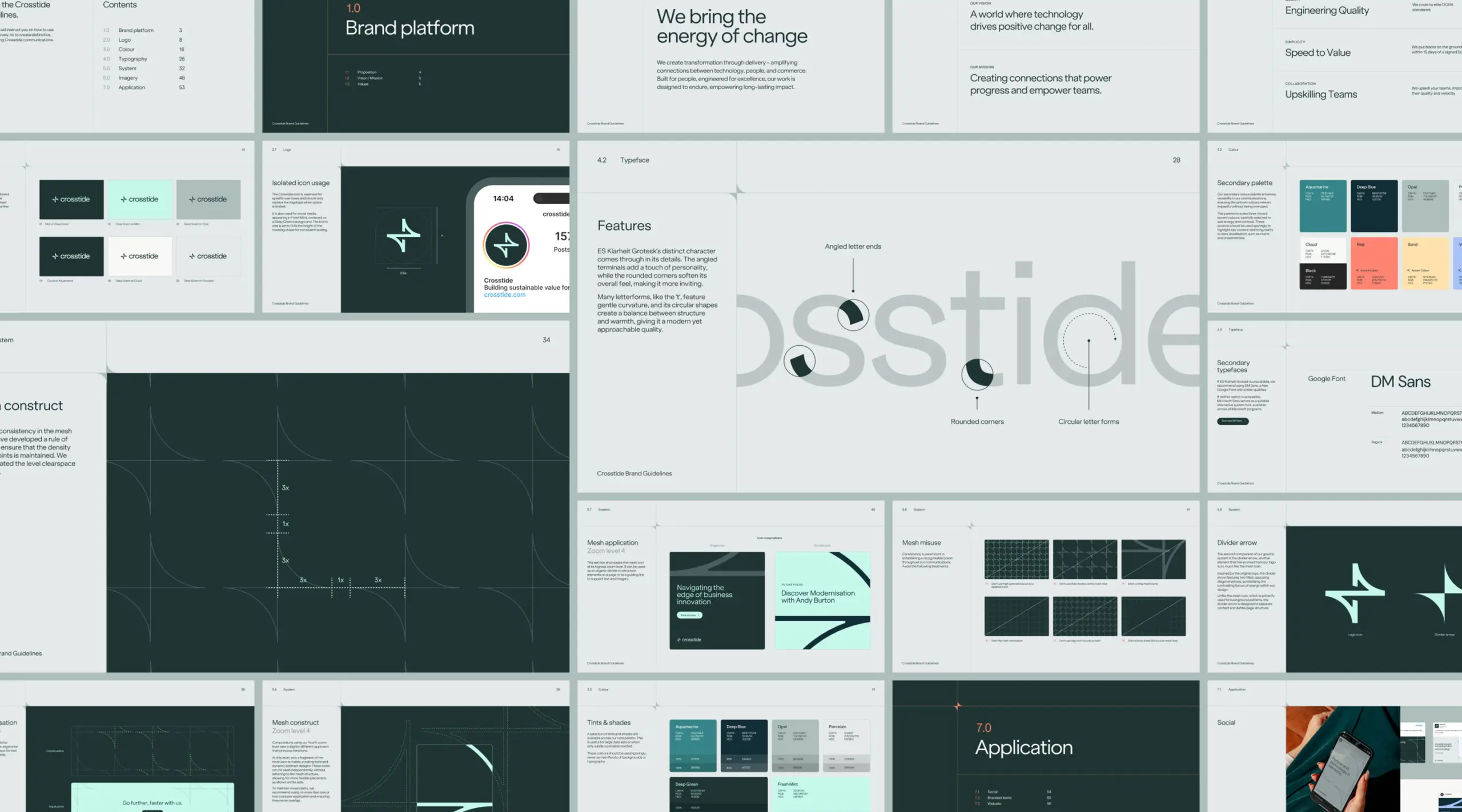
We began by uncovering their core truths: engineering excellence, practical transformation, and a deeply collaborative mindset. From there, we developed a new name, brand strategy and digital presence rooted in clarity, energy and credibility. The new brand needed to project assurance and maturity while remaining modern and human – an identity ready for boardrooms, but built for real-world delivery.
"The new brand had to project assurance and maturity, while staying modern and human."
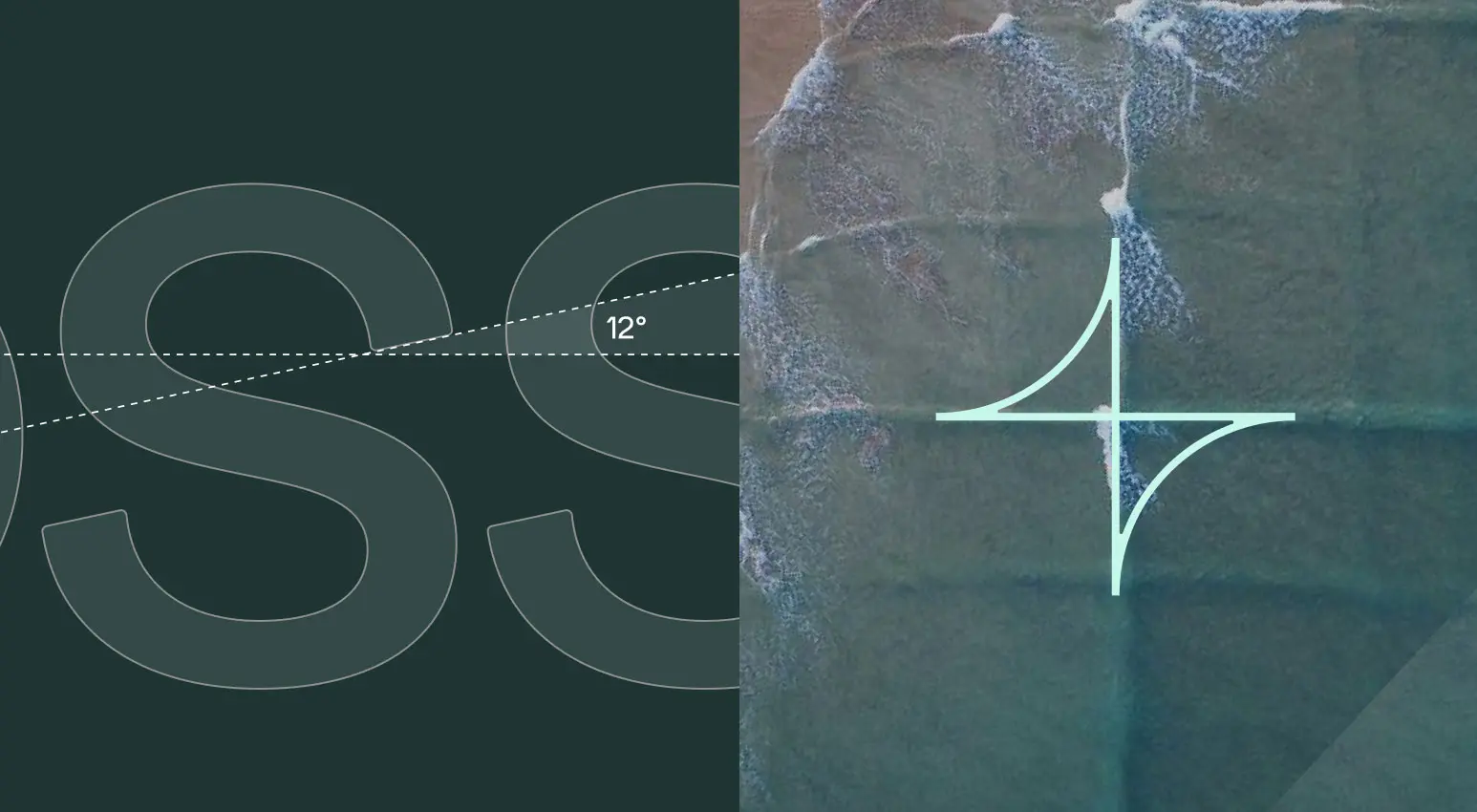
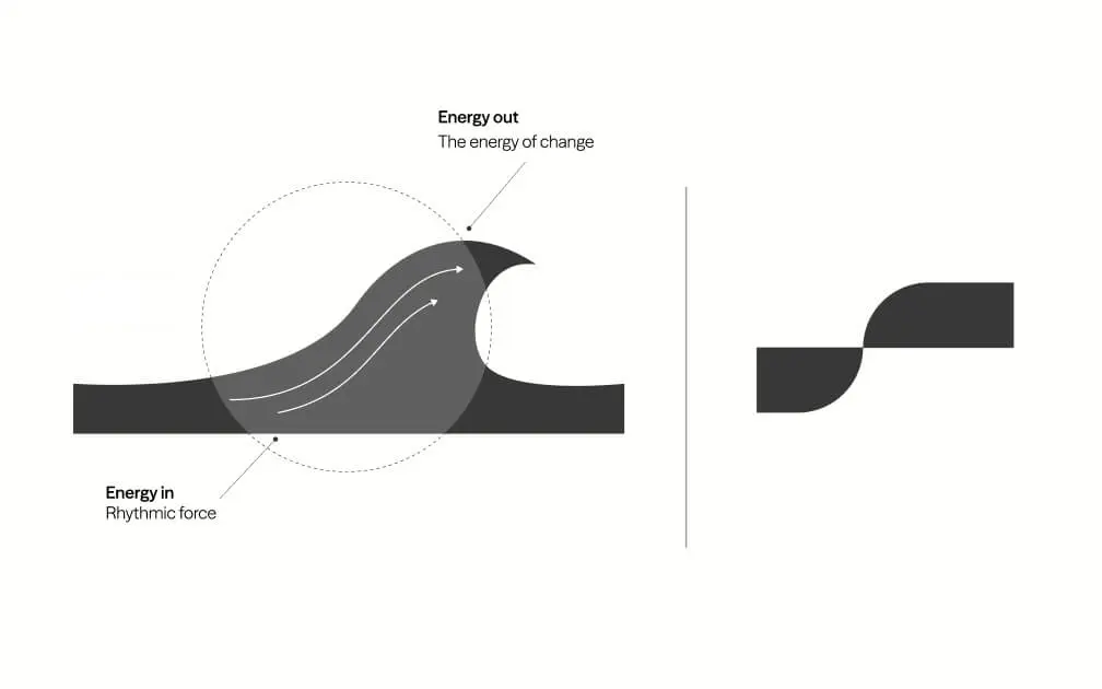
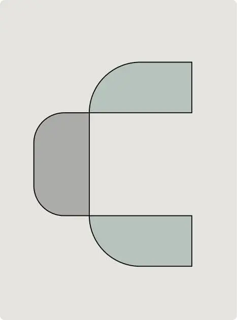
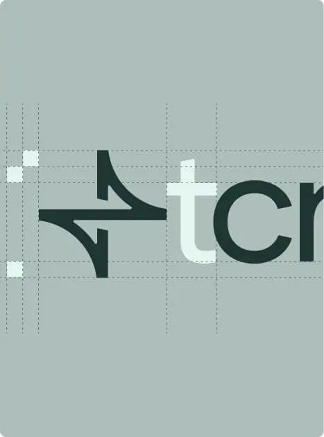
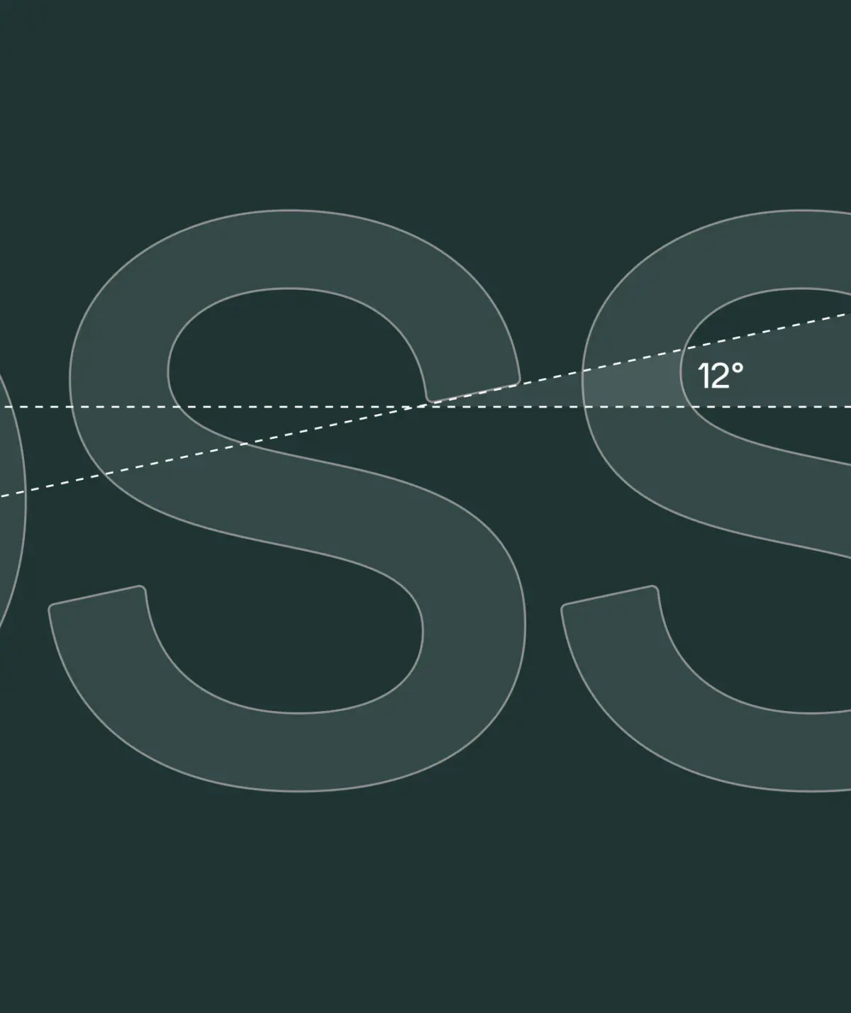
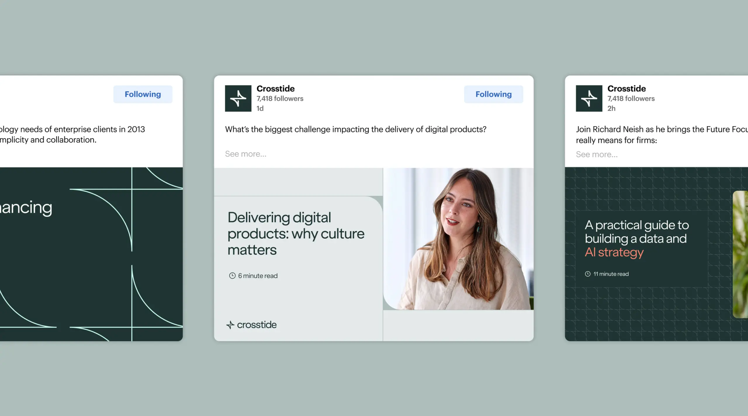
The name Crosstide emerged from a desire to express movement, energy and the powerful intersection of people, technology and progress. It captures their role as a catalyst – steering change, not just powering it. We called this “The Energy of Change”, which became the central value proposition.
Inspired by the merging of cross or square waves, the new brand captures the company’s dynamic energy and forward momentum. More than a name change, the transformation is a confident statement of intent – affirming Crosstide’s commitment to navigating complex industry currents and guiding clients toward meaningful outcomes.
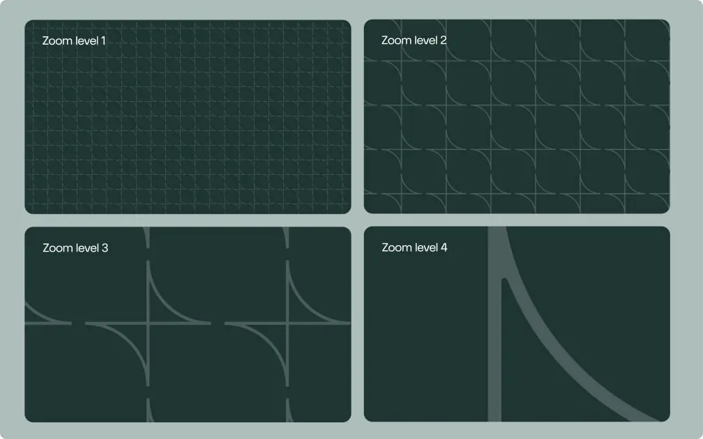
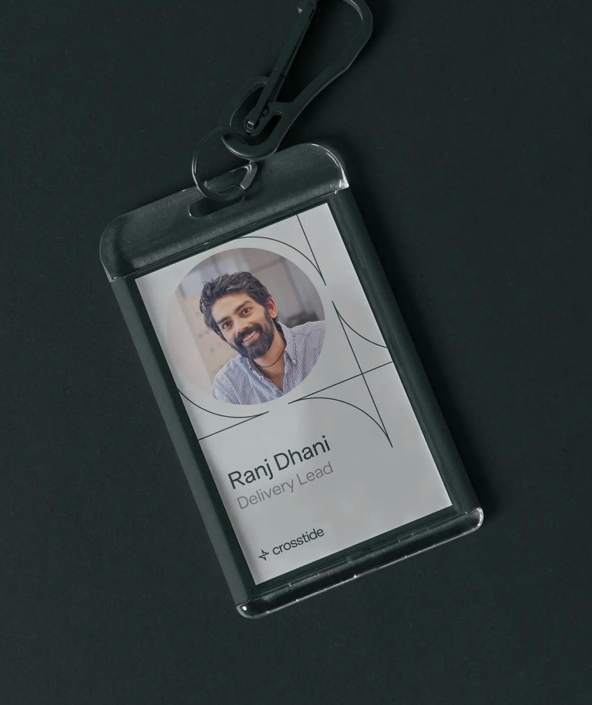
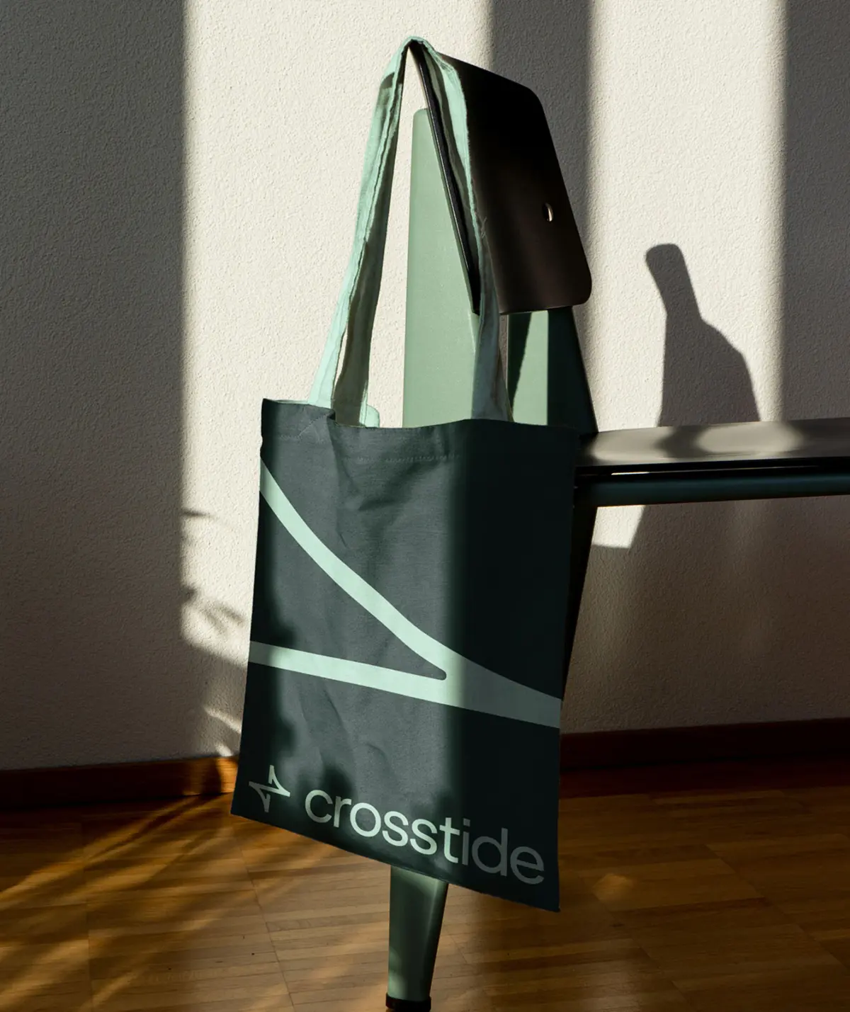
The design aesthetic introduces a subtle nautical influence, pairing deep sea greens with vibrant aquamarines. The brand typeface, ES Klarheit Grotesk from Extraset, balances contemporary clarity with human warmth.
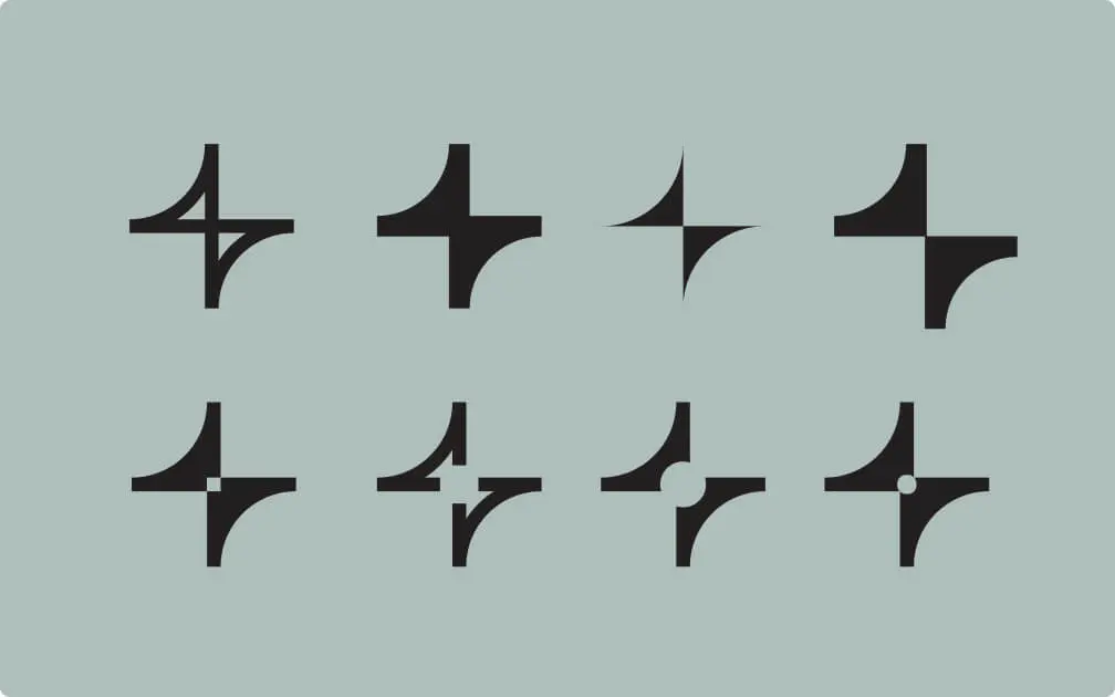
To rise up, we first go deep down. Deep Making is where we uncover hidden truths and overlooked gaps. It’s our space for the unexpected and the different. These experiments, in-progress thoughts and unused directions are all part of our design process that help turn ideas into enduring brands.
Rising to the challenge of setting a new direction for a business with ambitious growth plans
Crosstide, formerly known as 101 Ways, had outgrown its original name and outdated identity. As the company evolved and entered a new phase of growth – including ambitions to expand into financial services and other sectors – it became crucial to establish a brand narrative that reflected its expertise, confidence, and vision.
“We have a new brand that we are extremely proud of. I feel that Ascend paused, took a breath and genuinely listened to us throughout the process. Not all agencies have the confidence to (actually) collaborate, and it allowed us to find a way forward together with high craft and low ego.”